This was a project i started during a graphics internship at Ogilvy and Mather. The brief given to me by my mentor was to visualize the identity for a new and international (hypothetical ) music school which prides itself on being professional and in-depth with their education.
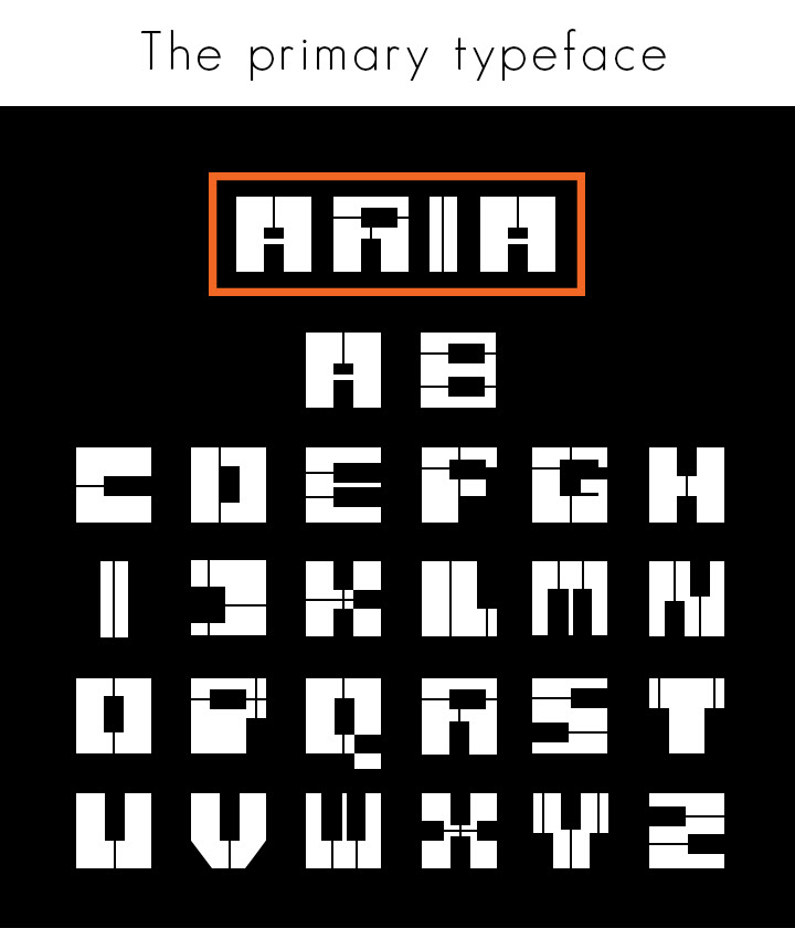
I created everything from scratch, including their brand name,logo, their typeface, and their style.
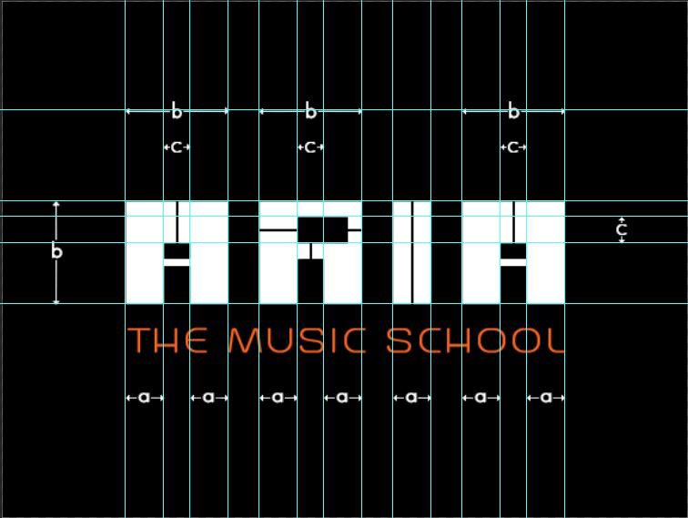
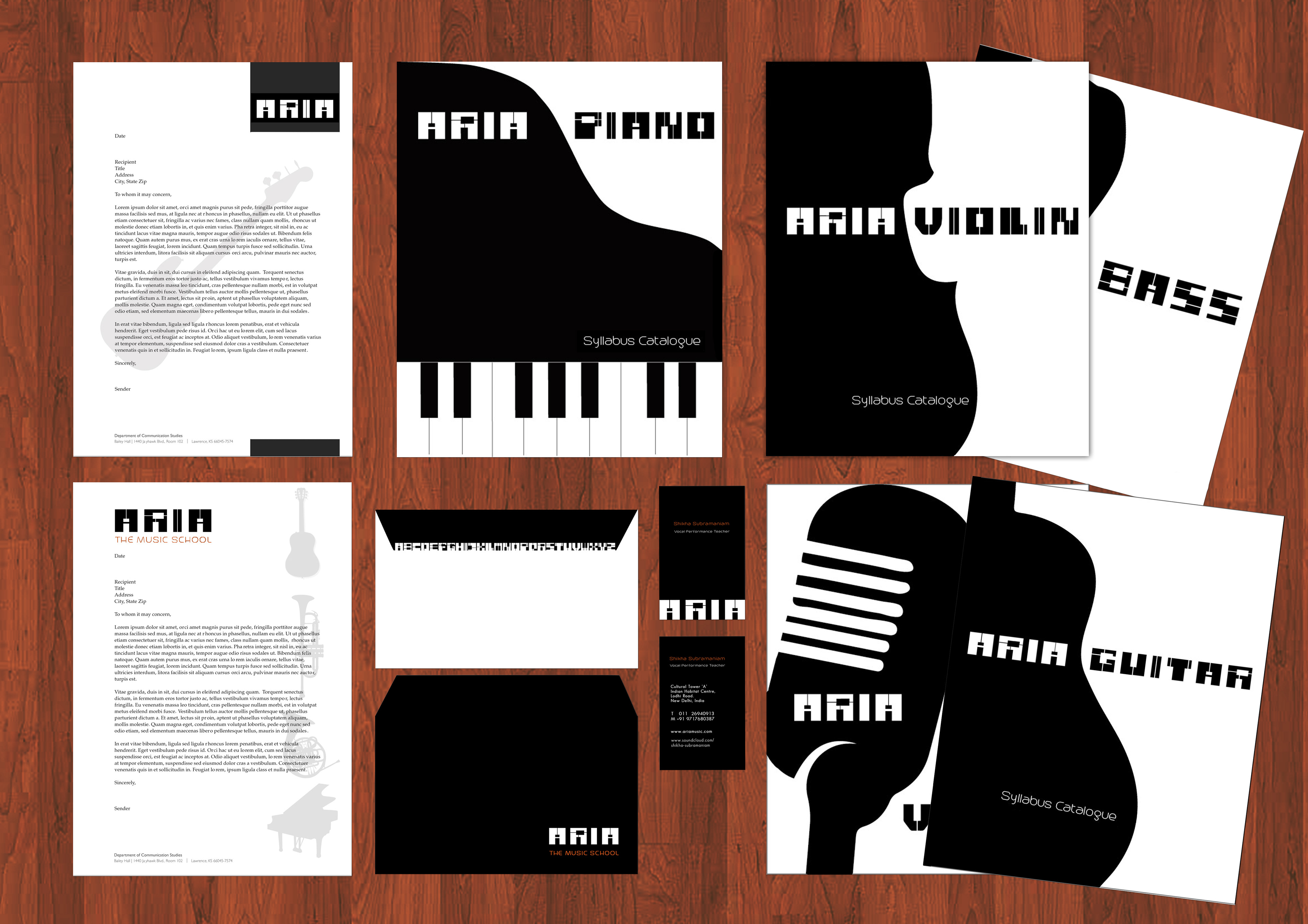
I've used black and white for the logo and for the official articles to define their classic but pure and new brand identity, with a hint of orange for the fun and wild element that music can't go without.
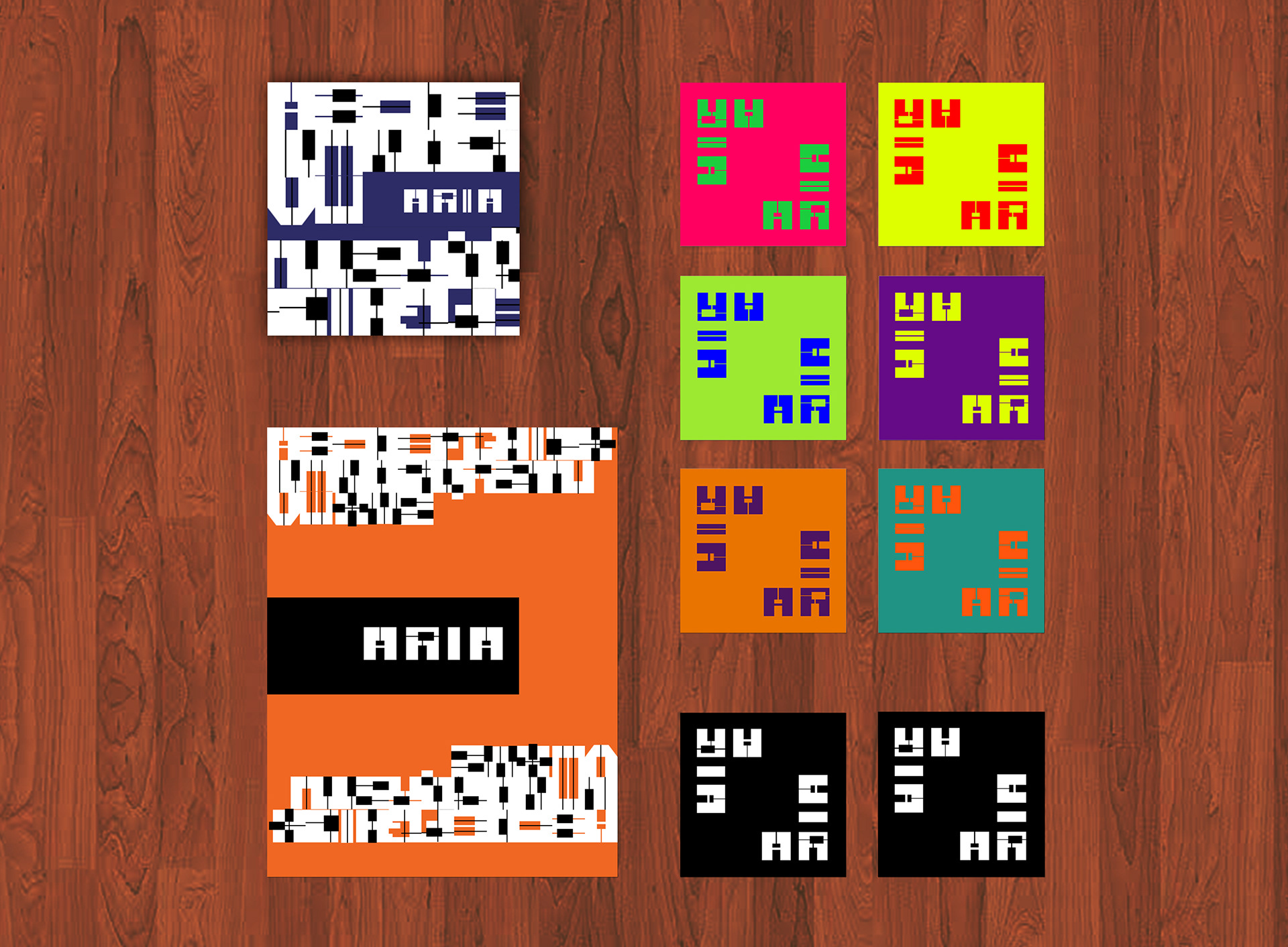
For the less official objects, I've let loose with a burst of colour and chaos, reminding students and visitors that music is an unbound and free art, even within the structure of education.

ARIA : a long, accompanied song for a solo voice, typically one in an opera or oratorio.


The official Art Board which follows has Two kinds of letterheads, An envelope, Visiting card, and Syllabus Ctalogues for different disciplines/ instruments.
The next Art Board shows Coasters, A CD Cover, and A notebook.
Note that the pattern has been made by reducing the gap between letters of the alphabet from A to Z to zero.